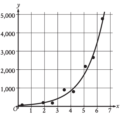
The scatterplot shows the relationship between the temperature, , and the number of visitors to a park, . Which of the following graphs shows the most appropriate model for the data? (Assume the scatterplot 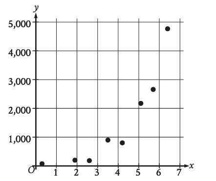 now displays points that initially decrease, then increase, forming a U-shape, indicating an optimal temperature range.)
A graph showing a straight line. 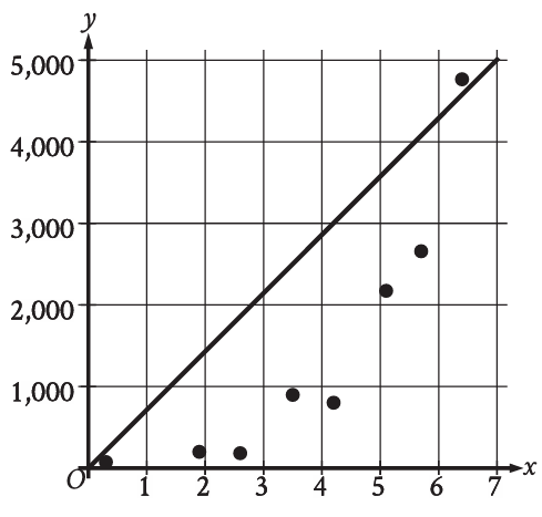
A graph showing an increasing exponential curve. 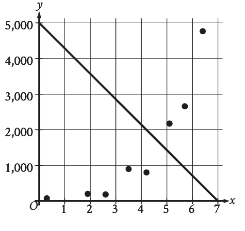
A graph showing a U-shaped parabolic curve that passes through the middle of the data points. 
A graph showing a decreasing exponential curve.