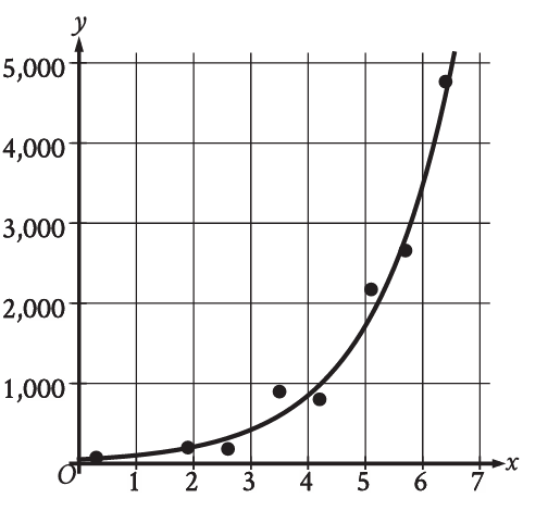
The scatterplot shows the relationship between the time elapsed, , and the concentration of a chemical, , in a solution. Which of the following graphs shows the most appropriate model for the data? (Assume the scatterplot 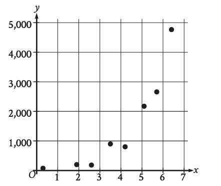 now displays points that rapidly decrease at first, then level off, characteristic of exponential decay.)
A graph showing a straight line with a negative slope. 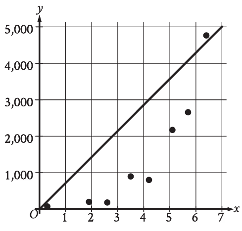
A graph showing an increasing exponential curve. 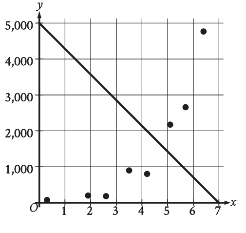
A graph showing a decreasing exponential curve that passes through the middle of the data points. 
A graph showing a U-shaped parabolic curve.