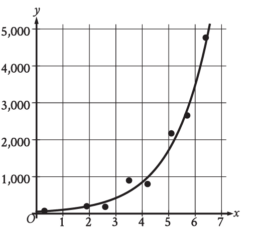
A researcher collected data on the growth of a plant over several weeks. The scatterplot shows the plant's height, , at the end of each week, . Which of the following graphs shows the most appropriate model for the data, considering that models should represent the general trend rather than connecting every single point? (Assume the scatterplot 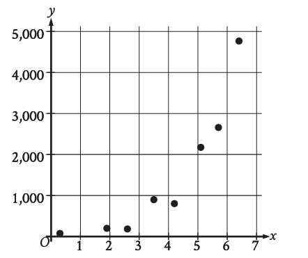 now displays points that generally show a positive linear trend, but with some slight variation and one or two points slightly off the main trend.)
A graph showing a straight line that attempts to connect every single data point, resulting in a jagged, non-linear path. 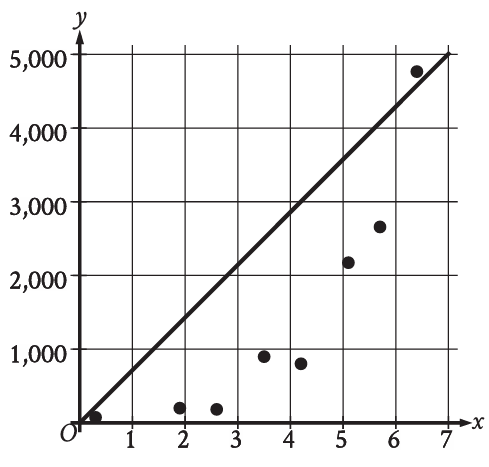
A graph showing a straight line with a positive slope that represents the general linear trend of the data, with points distributed above and below it. 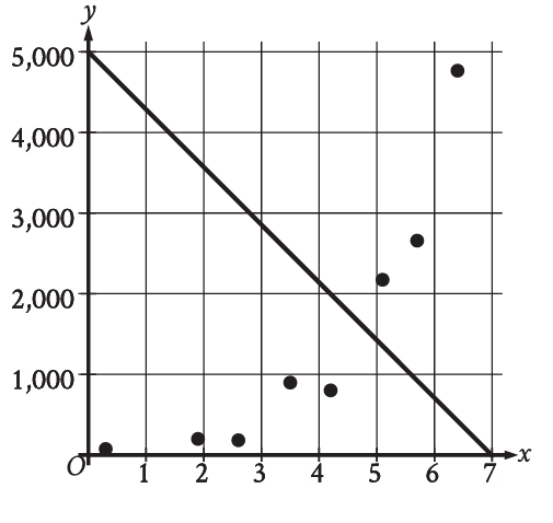
A graph showing a curved line that does not follow the general linear trend. 
A graph showing a horizontal line, indicating no relationship.